图片的瀑布流排列布局,之前我做这种需求都是使用 js + absolute 的方案来实现,实现的方法比较复杂,性能肯定也是比不上纯 css 的实现的,刚好我最近看到了 css 的 columns 属性,看到它的第一眼我就知道,这小子在实现瀑布流方面肯定是有所作为的
关于 columns MDN
columns 是用来设置元素的列宽和列数的,它有两个属性:column-width 和 column-count,分别用来设置列宽和列数,语法如下:
1
| columns: <column-width> || <column-count>
|
可以设置列宽和列数,但需要注意的是 column-width 不支持负值,也不支持百分比值
一个简单的实现
1
2
3
4
5
6
7
8
9
10
11
12
13
14
15
16
17
18
19
20
21
22
23
24
25
26
27
28
29
30
31
32
33
34
35
36
37
38
39
| <!DOCTYPE html>
<html lang="en">
<head>
<meta charset="UTF-8" />
<meta name="viewport" content="width=device-width, initial-scale=1.0" />
<title>使用 columns 实现瀑布流展示</title>
<style>
.flow {
column-count: 4;
column-gap: 10px;
width: 800px;
margin: auto;
background-color: #e5e5e5;
padding: 10px;
line-height: 0;
}
img {
width: 100%;
object-fit: cover;
margin-bottom: 10px;
}
</style>
</head>
<body>
<div class="flow"></div>
<script>
const flow = document.querySelector('.flow')
for (let i = 0; i < 10; i++) {
const height = Math.floor(Math.random() * 200 + 200)
const src = `https://picsum.photos/200/${height}`
const img = document.createElement('img')
img.src = src
flow.appendChild(img)
}
</script>
</body>
</html>
|
效果如下:
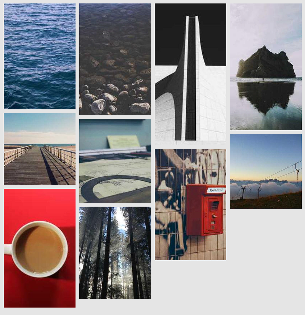
这样就已经完成了一个简单的瀑布流
卡片文字的展示
上面我们是直接展示了图片,那么如果我们希望 div + text 的组合也能实现这样一个瀑布流的布局是不是也能这样做呢?
下面我们就动手试试看吧:
1
2
3
4
5
6
7
8
9
10
11
12
13
14
15
16
17
18
19
20
21
22
23
24
25
26
27
28
29
30
31
32
33
34
35
36
37
38
39
40
| <!DOCTYPE html>
<html lang="en">
<head>
<meta charset="UTF-8" />
<meta name="viewport" content="width=device-width, initial-scale=1.0" />
<title>使用 columns 实现瀑布流展示</title>
<style>
.flow {
column-count: 4;
column-gap: 10px;
width: 800px;
margin: auto;
background-color: #e5e5e5;
padding: 10px;
}
.flow > div {
background-color: #ffffff;
margin-bottom: 10px;
padding: 5px;
}
</style>
</head>
<body>
<div class="flow"></div>
<script>
const flow = document.querySelector('.flow')
for (let i = 0; i < 10; i++) {
const div = document.createElement('div')
const content = [`这是第${i}个div'`];
const length = Math.floor(Math.random() * 200);
content.length = length + 1;
content.fill('好', 1);
const text = document.createTextNode(content.join(''));
div.appendChild(text)
flow.appendChild(div)
}
</script>
</body>
</html>
|
效果如下:
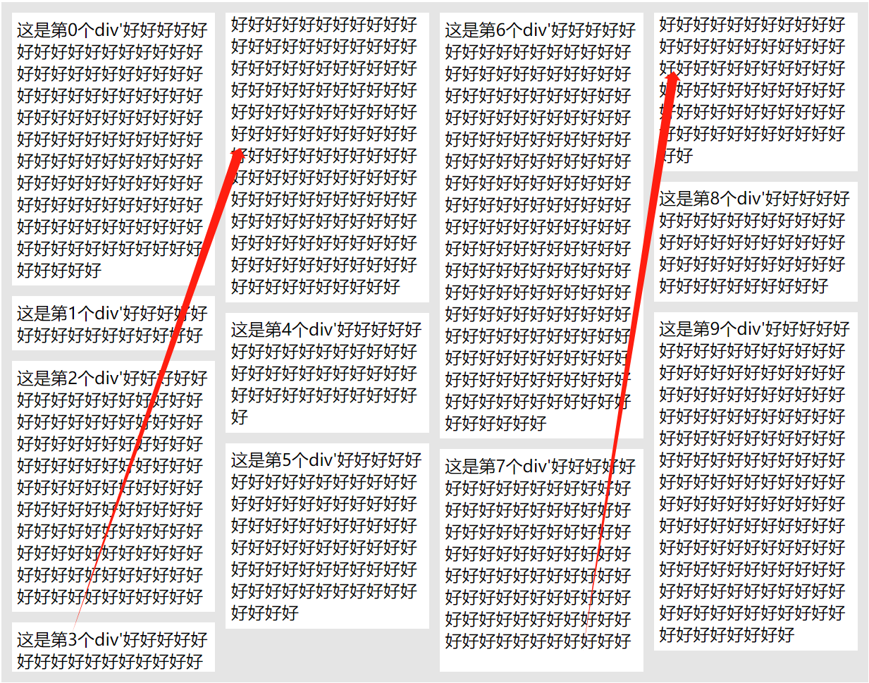
我们发现它并不像我们想象中那样展示,而是将 div 进行了截断
幸好我们还有一个属性可以设置他的中断方式,那就是在不想被中断的 div 中设置 break-inside: avoid 这样这个 div 就不会被从中间截断了,我们对上面的代码进行修改:
1
2
3
4
5
6
7
8
9
10
11
12
13
14
15
16
17
18
19
20
21
22
23
24
25
26
27
28
29
30
31
32
33
34
35
36
37
38
39
40
41
| <!DOCTYPE html>
<html lang="en">
<head>
<meta charset="UTF-8" />
<meta name="viewport" content="width=device-width, initial-scale=1.0" />
<title>使用 columns 实现瀑布流展示</title>
<style>
.flow {
column-count: 4;
column-gap: 10px;
width: 800px;
margin: auto;
background-color: #e5e5e5;
padding: 10px;
}
.flow > div {
background-color: #ffffff;
margin-bottom: 10px;
padding: 5px;
break-inside: avoid;
}
</style>
</head>
<body>
<div class="flow"></div>
<script>
const flow = document.querySelector('.flow')
for (let i = 0; i < 10; i++) {
const div = document.createElement('div')
const content = [`这是第${i}个div'`];
const length = Math.floor(Math.random() * 200);
content.length = length + 1;
content.fill('好', 1);
const text = document.createTextNode(content.join(''));
div.appendChild(text)
flow.appendChild(div)
}
</script>
</body>
</html>
|
效果如下:
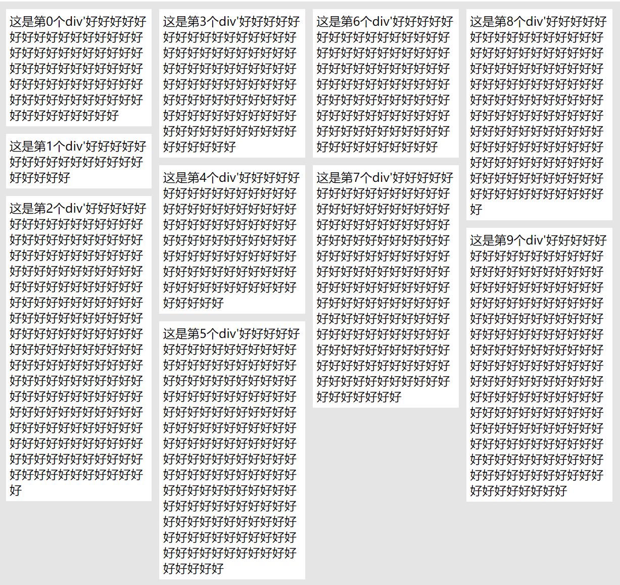
现在,它看起来就很合理了,到此使用纯 css 实现的瀑布流布局就实现了